Table of Contents
User group scores charts allow you to visualize and analyze user performance for specific user group. In this article, we’ll walk you through the process of effectively interpreting user group scores charts.
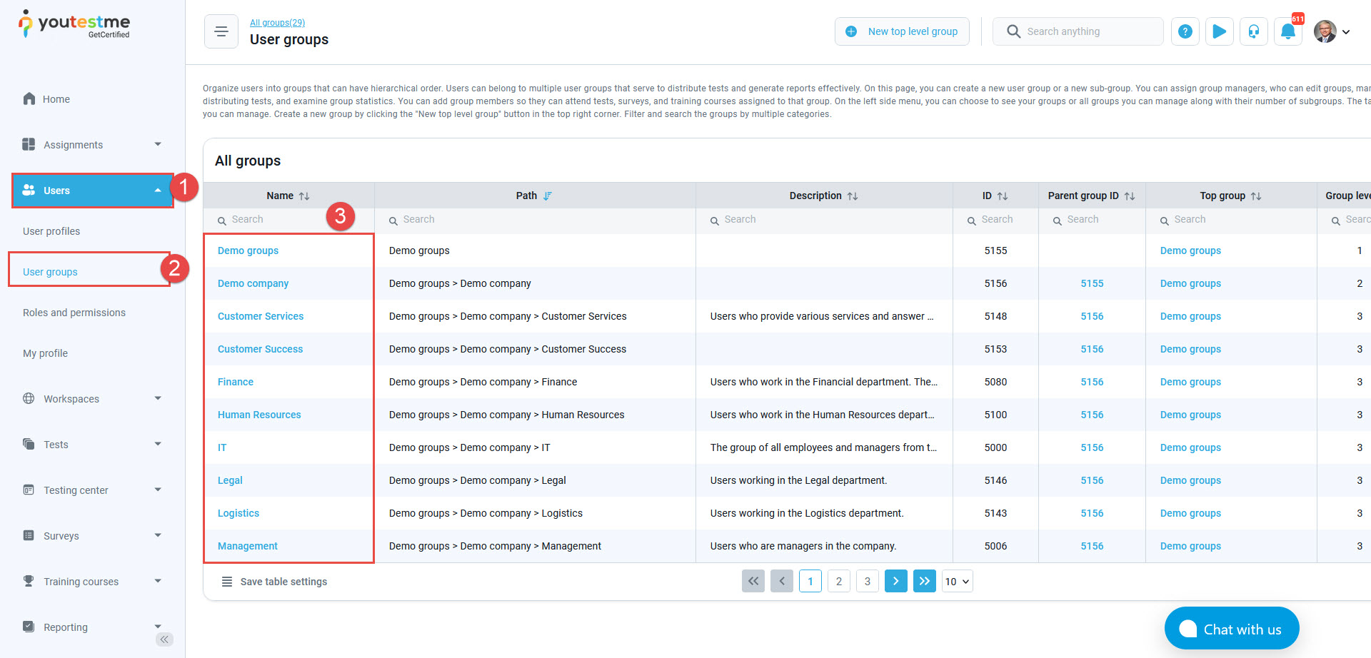
Accession the user groups #
- Click on the Users page.
- Select the User groups option.
- Click on the user group name to access it.
When you enter the specific user group, navigate to the Score charts. Generate a score chart by:
- Click on the Add button.
- Selecting either a test, survey, or specific group members to be included in the statistics.
- Choose your preferred chart format, whether it’s a linear or bar chart.
- Preview the score chart.
- Click the Show detailed results button to display the score chart statistics in table form.

Example – Adding Members to the Chart #
In our example, you can add two candidates to the chart as follows:
- Select the desired members.
- Click on the Confirm button.

After adding them, you can proceed as follows:
- You will notice the names of the members appearing in the list below, and you can then compare their results. Each candidate is represented by a specific color on the chart.
- Choose the chart display for each member.

For tracking the success of a specific user group, this article underscores the critical role of analyzing user groups and visually representing their results in order to improve user experiences.